UI vs. UX: A Culinary Comparison
This article will combine storytelling with analogy to approach the subject of explaining UX differently.
Originally published on Springboard
Oct 4, 2018
If the title of this article drew you in, there’s a good chance you’ve seen some kind of Venn diagram with a dozen circles showing the overlap between user interface (UI) and user experience (UX). This article doesn’t dispute any of that. But it does explain UI vs. UX in an alternate way.
One of the most powerful techniques a UX designer can wield is storytelling . Stories allow an audience to relate to a subject in a more meaningful way and hopefully help them understand it better.
This article will combine storytelling with analogy (or the concept of mental models in UX parlance) to approach the subject differently.
The Cooking Analogy
Let’s start by stepping out of the digital world.
Consider the thinking that goes into preparing a meal. Good ingredients increase the likelihood of making a tasty dish; however, the way those ingredients are prepared and combined is also very important. Additionally, the pairing of dishes in a meal or across courses matters.
A good meal is comprised of ingredients assembled and manipulated intentionally to create an appealing flavor that is greater than the sum of its parts. This is what a good user interface does.
And yet, the experience goes beyond the meal!
By focusing on the food, we haven’t talked at all about the customer’s goal for the meal, or their expectations given the money they’ve paid. A four-star meal may be appropriate for an anniversary dinner, but totally wrong if the diner is primarily interested in getting a quick bite before heading into an important meeting. And your level of satisfaction from a hamburger depends a lot on whether you paid $5 or $50 for it.
The experience and the food are connected, yet separate.
Think about the restaurants in your area. Why do some of them stick around for decades while others come and go? Is it because the long-lasting ones have the best food and the others have the worst? That is certainly a factor, but the larger experience is a better indicator. How is the service? What’s the ambiance? Is the location convenient? Do they entice you with coupons or “happy hour” discounts? Do you feel that you get what you pay for?
And now, let’s move from the culinary plane to the 2D world of screens.
A Deep Dive Into UI Design
So, what is user interface design? It’s surprisingly hard to define. The crowdsourced (i.e., Wikipedia ) definition essentially says that “user interface design is the design of software user interfaces,” which isn’t very enlightening.
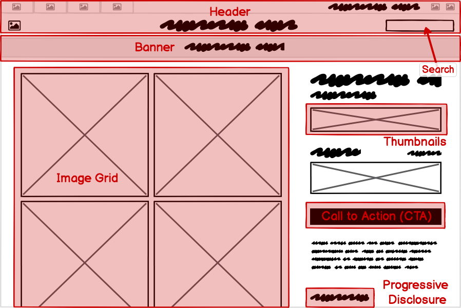
A better way to understand it is through the process of deconstructing a user interface into the areas that a UI designer is concerned with . There are actually multiple layers of UI design and multiple factors that a UI designer considers when creating a user interface.
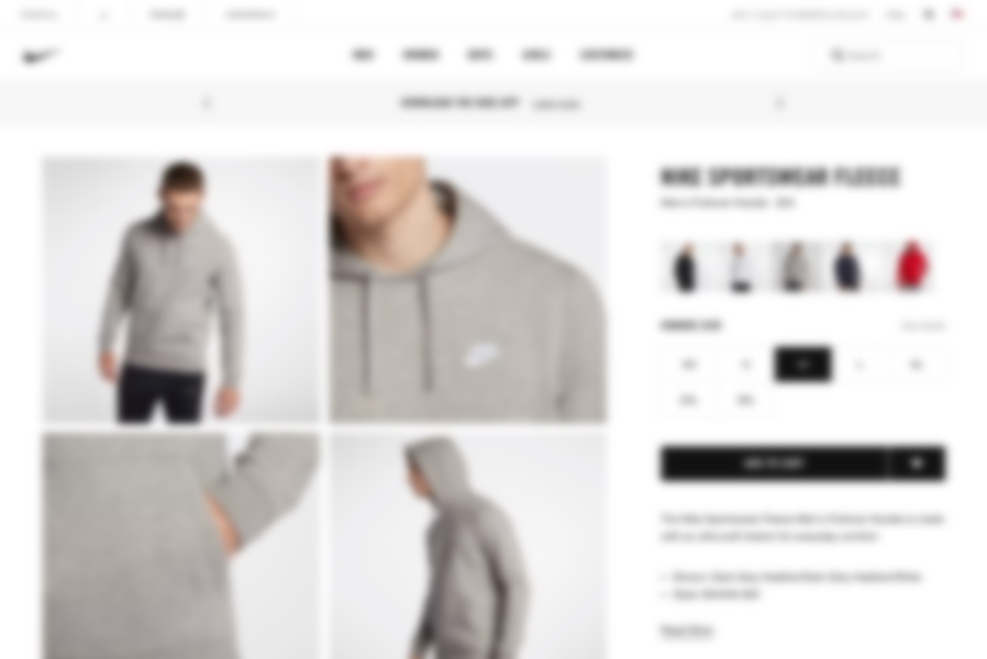
Let’s start with an example. Here is a typical user interface on a website.
Note: There are slightly different UI considerations for web, mobile, desktop, and other types of software, but, generally speaking, they are all software, and the following concepts apply to all of them.
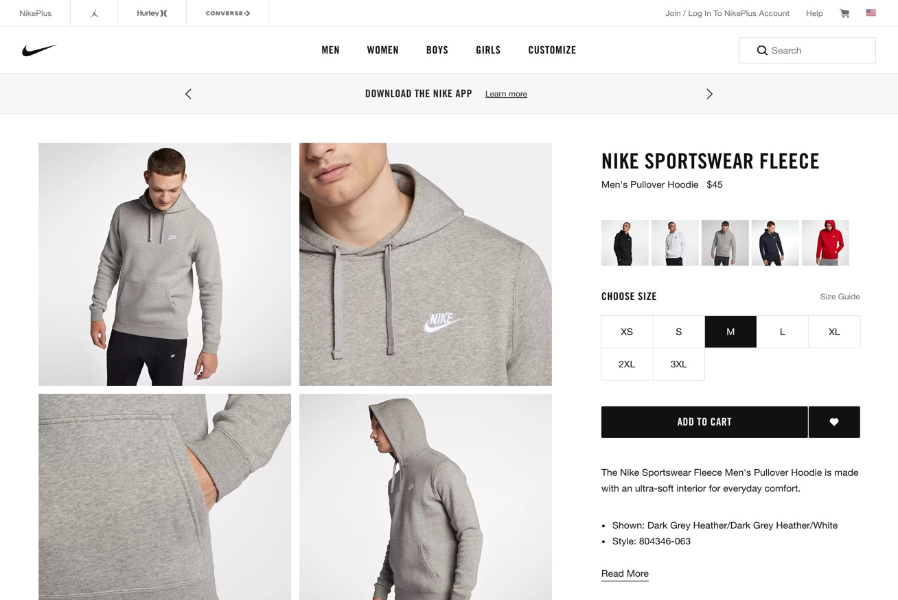
UI design is concerned with four viewpoints (or layers) of this screen:
- Controls
- Patterns
- Design principles
- Templates
So, let’s begin by stepping into the shoes of a UI designer to see how they might approach this website UI.
UI Design Layer 1: Controls
User interface controls are like ingredients in a recipe. Choosing the appropriate ones and using them in the right way lays a foundation for the rest of the interface.
But before diving into the controls layer, let’s simplify the page above by viewing it as a wireframe.
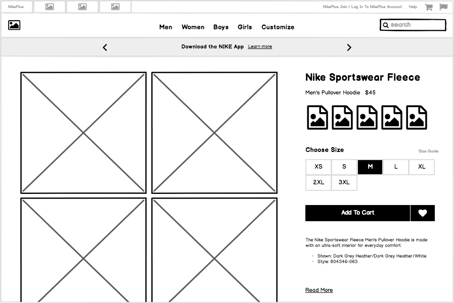
Now let’s look at some of the UI controls that were used to build this page:
User interface controls (also known as elements, components, and widgets) are individual pieces of a user interface that perform a single function. Some examples are links, buttons, and icons. Even plain text can be considered a control, since its function is to describe or label something within the user interface.
Each one of these controls was selected for a specific reason. UI design is concerned with the process and rationale of choosing controls.
UI Design Layer 2: Patterns
Returning to our analogy, even with the right ingredients/controls, things can go wrong. They can work well together, or not. This is where the process of creating patterns comes in.
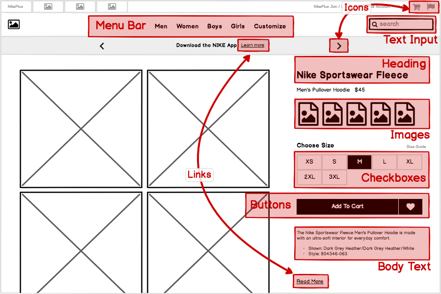
Let’s further simplify this page by decreasing the fidelity of our wireframe to abstract away the individual controls, like this:
Now let’s think about the groups of controls and what purpose they serve as units within the page. A UI pattern is a group of controls that function to solve a particular problem. Let’s look at some of the patterns on this page:
It can be useful to consider this layer of UI design even before moving on to the level of controls, as each pattern can meet its goals in different ways and using different controls.
UI Design Layer 3: Design Principles
Aesthetics matter. And they’re not as subjective as many people think. A meal has sensory characteristics beyond the response from your tongue. What it looks, smells, and even feels like affect its taste.
The most commonly understood definition of UI design is the visual design layer. But even this is more purposeful than most people understand. Visual design isn’t merely “making it look pretty.” A better way to think of it is as the application of established visual design principles , many of which are rooted in scientific psychological, neurological, or physiological understanding.
Common examples of these design principles are contrast, hierarchy, proximity, and alignment.
One way that UI designers evaluate design principles is using the “squint test,” which helps to further abstract the design into its visual principles. An alternative is to blur the screen.
Either way, the goal is to take your attention away from the content in order to focus on the visual effects and techniques .
UI Design Layer 4: Templates
Lastly, making dishes that are consistent and taste good together can be viewed as the difference between a cook and a chef. Templates are a UI designer’s secret weapon.
Looking at our example site as a whole, we can view this page as an instance of a template that can be reused across the site, rather than a single page that was designed for this particular article of clothing. For a site or product that can have dozens, or even thousands, of screens, it is useful both from the designer/developer and the end-user perspectives to have screens that behave predictably and look similar across the entire application .
The example we’ve been examining could be described as a “product detail view” template that would look very similar when any other product is viewed.
Another UI template is a category template, like this one:
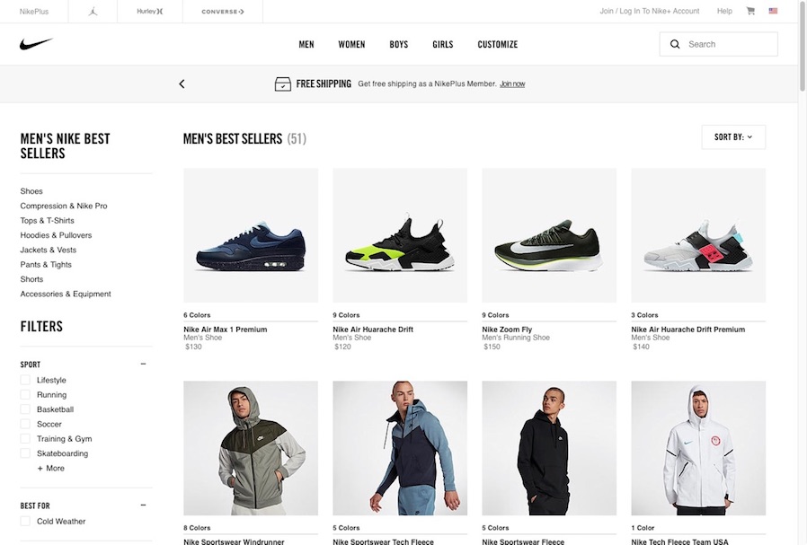
Other templates for this site might include one for checking out and purchasing, and another for displaying search results. While every product may use different types of templates, all software types can benefit from a template-based approach to design.
So What the Heck Is UX, Then?
Now let’s talk about the areas of UX that aren’t UI design. That is, what are the parts of a user’s experience that aren’t impacted by the areas described above?
Instead of looking at all of the areas that aren’t UI, like in the Venn diagrams, let’s dive into a few of them deeply for a different perspective, again using our culinary analogy.
Earlier, we talked about a few things that make a restaurant good or bad aside from the food. In the same way, a user can have a good or bad experience with your product, separate from the quality of the interface.
UX Is About Expectations
There’s a restaurant near my house that I avoided for years. The outside looks like this:
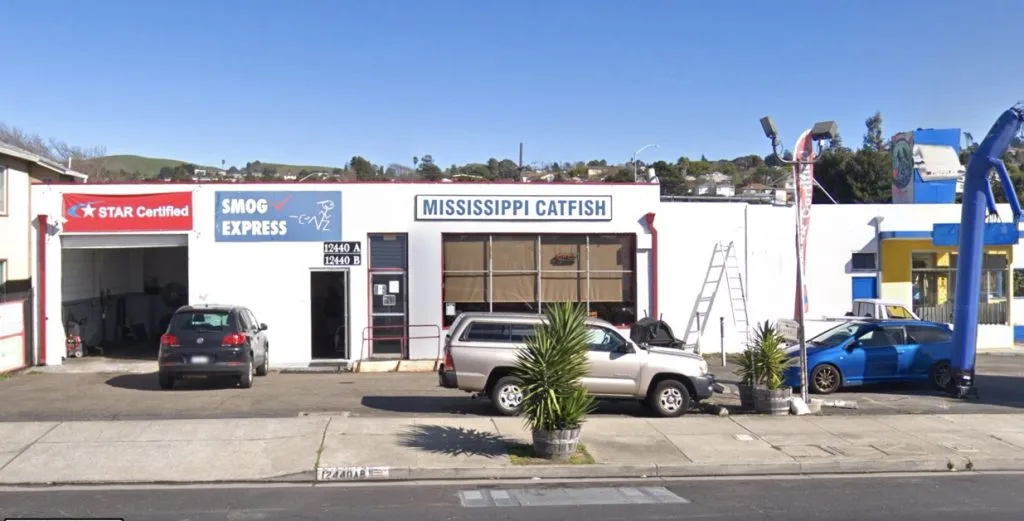
You can probably understand why I skipped it. It’s in a building with a smog check station on one side and a car muffler store on the other.
And yet…

I believe that the expectations set by the restaurant’s appearance affect people’s perception of the food. They expect a quick, inexpensive meal, but maybe don’t have high hopes for the food itself given what it looks like from the outside. The fact that the food is very good is what is called a delighter — something that goes beyond expectations (given the context; the same food might only meet expectations elsewhere).
Now look at this website:
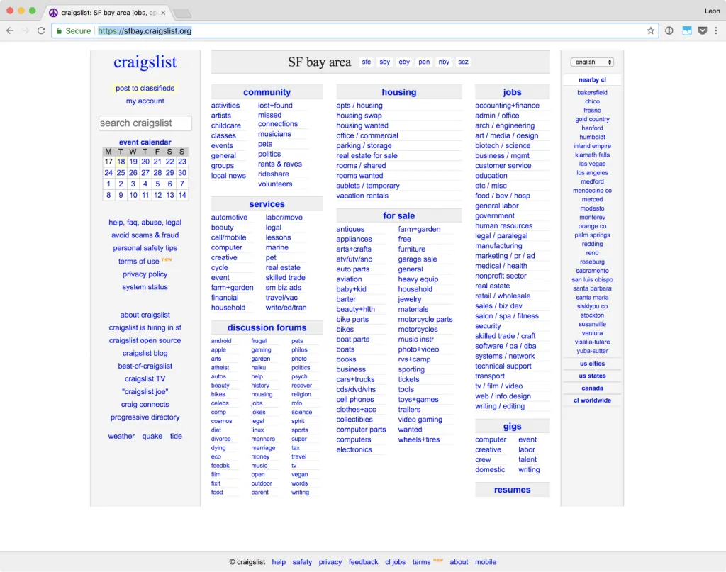
The design is very utilitarian. It’s not pretty. It sets the expectation that it exists to serve a simple purpose, but, like the catfish restaurant, you could be forgiven for expecting a poor result from it.
And yet, for decades people have been pleasantly surprised (delighted , even) by the usefulness of Craigslist and its ability to connect them to just what they were looking for. That delight is, in part, due to its functional appearance.
The lesson here is not that ugly design is good, but that people’s expectations are shaped by events that occur before they even touch a user interface. Part of UX is to design the pre-use experience with this in mind.
UX Is About (Perceived) Performance
Wait, isn’t making the application fast the developer’s job? What does UX have to do with speed?
Let’s say that the UI designer is the cook in a restaurant. Clearly, they are the key determinant in how fast the food comes out.
But think about what the waiter/waitress does. They usually ask you if you want something to drink first. This doesn’t take any effort from the cook, and it gives the customer something to do while they wait. Then, after you order, they bring you some bread that’s been prepared in advance. Within minutes of sitting down you are drinking and eating something, you are already having a restaurant experience, and you haven’t even tried any of the real food yet. Lastly, if the food is taking an extra long time, a good waiter or waitress will update you, possibly telling you how much longer you can expect to wait.
Even in a casual restaurant, you get an order number, which gives you an idea of how long you’ll have to wait.
Waiting 20 minutes for your food with nothing on the table feels a lot longer than 20 minutes with a good glass of wine and some snacks. It’s not the absolute time that matters as much as the perceived time.
What does this have to do with UX?
Well, have you seen something like this before?
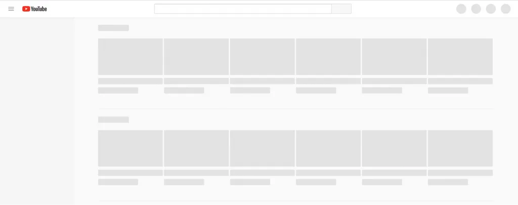
Sites like YouTube and Facebook use skeleton, or placeholder, screens to show you something almost immediately. These are the bread and butter that the waiter/waitress gives you. By providing a hint, a preview, of what is coming, you begin the experience earlier and the wait time doesn’t feel as long.
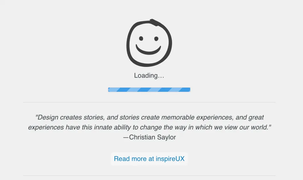
This is really just a novel variation of the perennial loading indicator, which has long been used to tell the user that, yes, something is happening.
So, UX is also concerned with the transitions between experiences.
UX Is About What Happens Over Time
A user interface is mostly a static object. It may have dynamic elements, but, generally speaking, a software product consists of a series of user interface screens connected together.
A user’s experience, however, is very dynamic and can’t be captured in a moment in time. Just like a customer’s restaurant experience begins when they walk in the door (or even before, as we saw above) and ends when they leave. It is how they are greeted, what the interior looks like, how much the food costs, the friendliness of the waitstaff, the music, the lighting, and their own individual mood and expectations.
And each of those factors has an impact as they occur over the duration of the experience.
The same is true for software.
A great UX tool that designers use for visualizing and reflecting this reality is a journey map:
“In its most basic form, journey mapping starts by compiling a series of user goals and actions into a timeline skeleton. Next, the skeleton is fleshed out with user thoughts and emotions in order to create a narrative. Finally, that narrative is condensed into a visualization used to communicate insights that will inform design processes.”
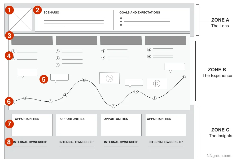
Journey maps and similar tools suggest that the process, the flow and the feeling, can also be designed.
So, UX is concerned with the “touch points” along the experience.
UX Is About Matching the Product to the User’s Goals
Finally, a UX designer has to think about whether the product addresses the user’s goals. Simply put, does the thing actually do what I want it to do, or is it the right solution to the wrong problem?
If I really want a hamburger and all you serve is chicken, I’m going to leave disappointed, regardless of how tasty the chicken is or how pleasant the ambiance is.
In the end, UX is about user advocacy. A UX designer should know what users want and don’t want.
Hungry for More?
One of the great things about the field of user experience is that it is so many things. It attracts people from all educational backgrounds and life experiences. You can be a terrible artist and still be a great UX designer. You can be an engineer or a writer or a psychologist and be a UX designer.
Moreover, you don’t actually have to be a UX designer to do UX design. A good CEO is constantly thinking about the experience their customers have, from the first point of contact to the last. And at the highest level of UX maturity, UX is woven into the fabric of a company, such that essentially everyone contributes to it.
But if that makes the question of the difference between UX and UI too complicated, just think of UI as the food and UX as the restaurant. It’s close enough.